What do we think about when we look at a painting? When we first look at a sculpture? When we look at a city, things in a closet, or a Rubik’s cube? We decide whether we like it or not.
Most of the time we don’t consciously ask this question, but our brains are used to answering it. We won’t live where it’s not pretty, we won’t eat food whose color we don’t like.
Our brain strives for perfection everywhere and in everything, and it has certain principles on how to define that perfection. With four simple tips, you can create any product that is perfection for your brain.
1. Complementary colors
The most popular advice most people working with color give. Except they don’t always explain what it means. Complementary=contrasting colors that are on opposite sides of the color wheel. Add life, brightness and energy to your design.

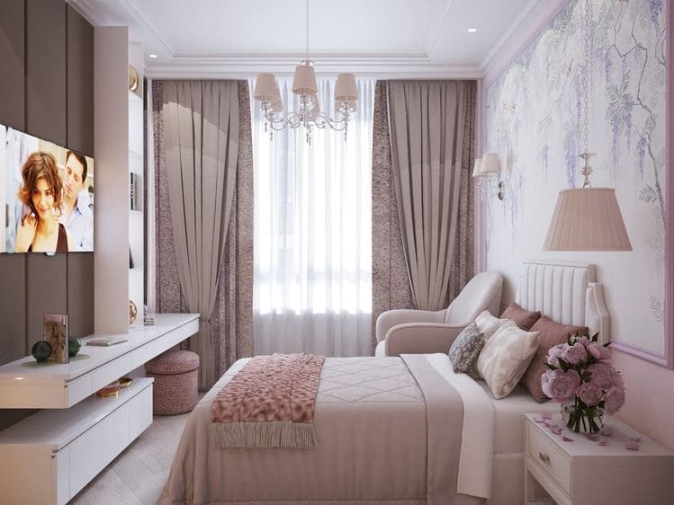
2. Three colors
The optimal choice is to combine three colors (primary, secondary and accent colors) at 60%, 30% and 10% respectively. The main or background color should be calm. The secondary color could be the shade next to the foreground color in the color wheel. A complementary color could be an accent color, and now you know what it is.

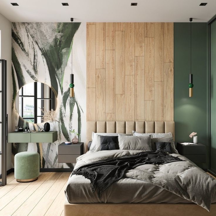
3. Linking Colors
Achromatic colors is another specific name for colors that have no temperature. Gray, white and black. To visually increase or decrease the space, to dilute the brightness of colors or to connect the existing shades will help exactly achromatic colors.

4. one segment
In this case, colors are used from one segment of the color wheel. To diversify this design can add contrast or, conversely, achromatic colors.

Author:Uliana Zharikova