Last time we talked about bedroom ergonomics. Where and how to arrange the furniture. And what kind of furniture to put? What color should we choose? Are there combinations that won’t go out of style? It all depends on the style you choose. Sometimes it’s hard to choose from a variety of choices. So today we’re going to go in reverse and talk about outdated designs that definitely shouldn’t be chosen.
Fashion is cyclical, and sometimes forgotten things become relevant again. But living in the present day, with real fashion, let’s talk about relevant and not relevant things at the moment.

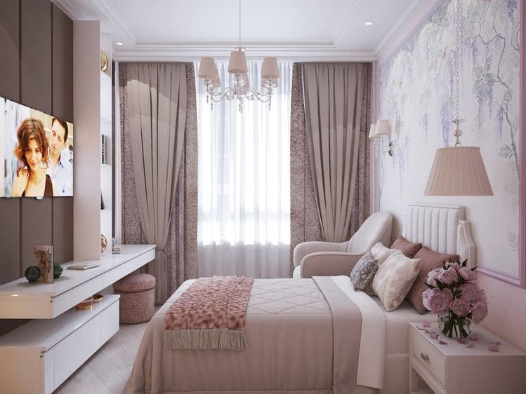
Little Greece, with columns, “pomposity” in the form of gold inlays and white blank walls, has long gone out of fashion and is not going to come back yet. This style is better left for a more appropriate place than an apartment. If you want a bright interior, it is better to mix several shades of the same color spectrum.
Article on how to properly combine colors: https://hjf.c2c.myftpupload.com/article-how-to-combine-colors-if-youre-not-an-artist-4-fundamental-rules/

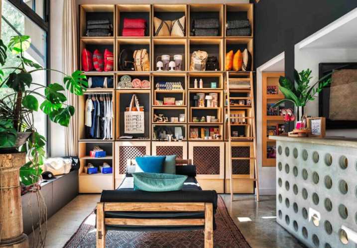
Displaying souvenirs and figurines brought from other countries creates a museum feel. “Grab a ticket and make your way to the first rooms of the exhibit”: roughly the words would say the interior of a home with small items reminiscent of travel on every corner. Collecting memories in the form of photos, magnets and seashells is best kept in one place. This will allow you to create a separate corner of coziness and attention will not be scattered when you want to dip into nostalgia.

Deafening division of zones in the house has long been an anti-trend. Thick walls, lack of niches and all kinds of partitions can create a feeling of constraint and lack of freedom of movement. It’s better to find a balance between separation and probing. Personal space, such as a bedroom, study or bathroom, of course, should be clearly separated from those places where people relax, cook and have fun. But the kitchen-living room space is better probed. This can be a glass partition, probing with colors and textures, or lighting.

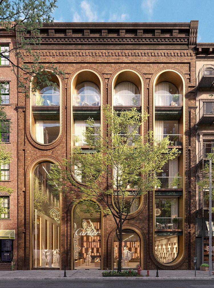
As for architecture, there are anti-trends here, too. In private homes, it’s best not to use wild stone and dark corner inserts on the façade. This will significantly spoil the proportions and will not highlight the details that one would like to show. With bright colors and solutions “not like everyone else” is to be careful. For a house to look harmonious and natural, it is important to consider the environment. If you live in the region of Balat, then buy the most catchy colors. But if in a private neighborhood, where there is a garden across the street and there is a certain concept of the neighborhood, then you should consider not only your comfort, but also the comfort of those around you.
Article about the styles of architecture: https://hjf.c2c.myftpupload.com/article-three-basic-styles-in-architecture/
In conclusion, I would like to say two phrases. The first: “Design should be simple, but not primitive” designer, inventor and businessman Artemy Lebedev. Add details to your design, but don’t overdo it. Combine multiple colors that fit together. You need to find a balance in everything. That is the second phrase.


